Tinder Today
A feature for Tinder users seeking a match, today.
Context / Class project
Team / 4 other designers + me
Role / User Research, Wireframing, Prototyping, User Experience Design, Visual Design
Project Duration / 2 months
Tools / XD, Photoshop, Illustrator
01 Problem
02 Research
03 Design Process
03.1 Ideation
03.2 Wireframes
03.3 Prototypes
04 Solution
05 Learnings
06 Next Steps
01 Problem
“Tinder just doesn’t feel efficient. I’m pretty frustrated and annoyed with it because it feels like you have to put in a lot of swiping to get like one good date.”
Elizabeth Hyde is not alone. Tinder’s strives to “make being single more fun and rewarding by connecting people who may not have otherwise met in real life.” However, while the gamified swipe system has made meeting people more fun, the lack of customization and filters has made users start to feel like all they do on the app is swipe … and swipe… and swipe.
How can we improve the Tinder experience to help users find what they are looking for faster?
02 Research
To begin, we aimed to gain a deeper understanding of Tinder users’ motivations and overall experience. Because Tinder’s user base is primarily millennials (60%), we wanted our research to reach this demographic group. Our team had a two-pronged research approach: digital survey and in-person interviews.
Digital survey: The goal of the survey was to identify any overall trends on people’s general experience using Tinder. To create the survey, we curated a list of demographic and user experience questions. We distributed the survey through both social media and Tinder over the course of one week, ending up with 128 responses.
In-person interviews: The goal of these interviews was to gain more insight on the user journey of a Tinder user. We wanted to know what causes them to open the app, stay on the app, close the app, and, ultimately, what happens after they close the app. We were also interested in hearing personal stories on positive and negative Tinder experiences. We conducted ten interviews over the course of one week.
02.1 Personas
Through our research, we uncovered two different ways people use Tinder.
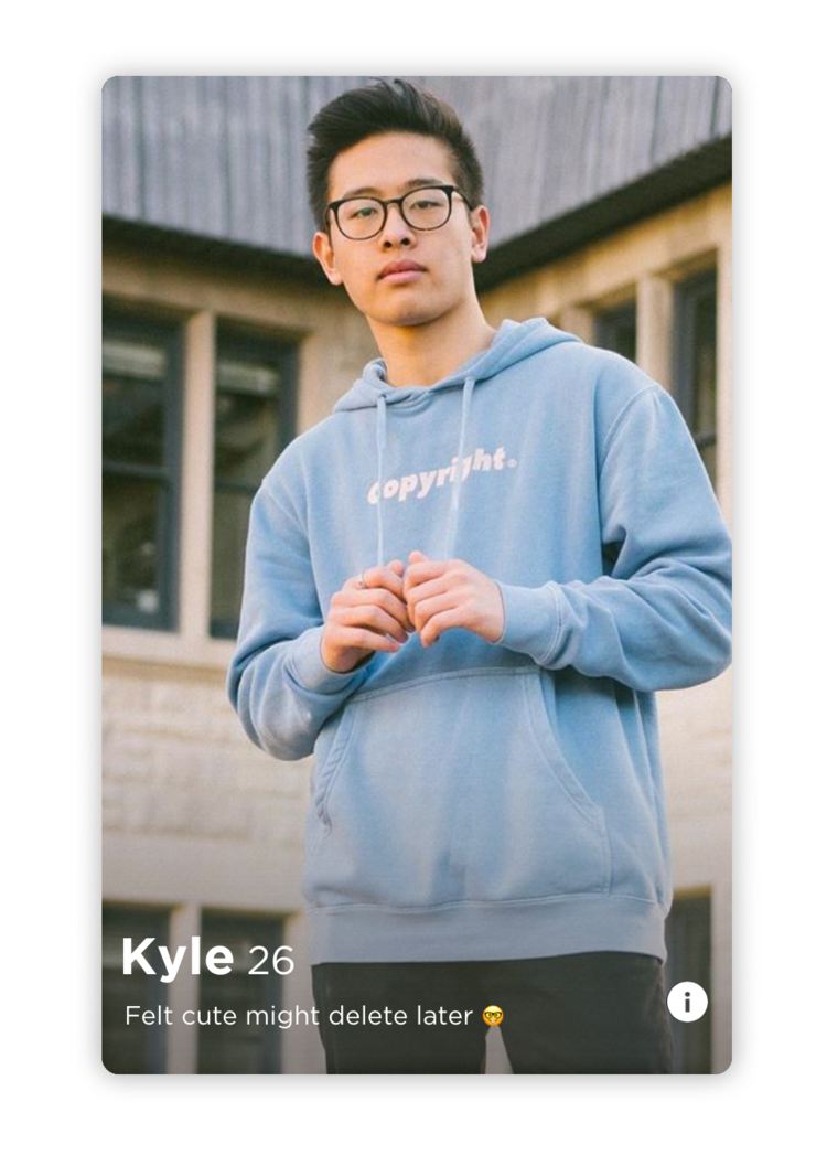
Kyle, 26 / App → Intention
Kyle is not actively seeking a relationship. For now dating is a nice-to-have, not a must-have; however, he still frequents the app. He opens Tinder maybe once or twice a day, swipes through a few cards, responds to a few messages, and closes the app. He’s not in a rush to develop meaningful connections and is having fun exploring his options on the app.
Christine, 21 / Intention → App
Christine has no plans tonight and wants to make some. She pops open Tinder, hoping to find someone who is free tonight to hang out. She spends a lot of time swiping right on potentials and when matched, has to vet out which matches are free tonight. After balancing conversations with multiple matches and countless ignored messages, she finally finds someone late in the night and wonders if she’s too tired to go out now.
The difference between Kyle’s and Christine’s user journeys is that Christine had a need that drove her to use the app whereas Kyle uses the app with the idea that maybe he’ll stumble upon something that he’ll want. Currently, Tinder caters perfectly to Kyle; his user journey is easy and smooth. Tinder’s no-frills, picture-based interface provides just enough information for Kyle’s casual browsing, and the seemingly never-ending stack of profile cards keeps him coming back for more. Meanwhile, Christine’s user journey is time-consuming, inefficient, and frustrating. She knows what she wants, and she wants it now. But who else on the app feels the same way?
02.2 Pain Points
For users who have an immediate need in mind...
It is takes too much time to sift through new and old matches to fulfill the need.
It is difficult to find a match with the same immediate need.
03 Design Process
03.1 Ideation
My team and I started by brainstorming ideas that could alleviate these pain points.
How might we give users who have an immediate need more visibility?
How might we allow users to know what a potential match’s immediate need is, assuming they have one?
Through these questions, we realized that users with an immediate need do not want to waste time swiping through profile cards of people who are not available now. To only display people available now, we can…
OPTION 1: Provide an “available now” filter
Strengths: Easy to find people available now
Limitations: Have to specify need in bio, can’t simultaneously swipe in “regular” Tinder, accessing filters might require multiple taps (profile → settings → filters → available now → exit → return to deck)
OPTION 2: Have a separate deck of cards for people available now
Strengths: Clearly separates the two personas, pre-set needs help only display people with similar needs, can also swipe in “regular” Tinder
Limitations: Might miss people who are available but did not mark themselves as so
OPTION 3: Tag on profile
Strengths: Easy to add, clear to others your intention
Limitations: Have to specific need in bio, all cards in the same deck: hard to find others/hard for others to find you
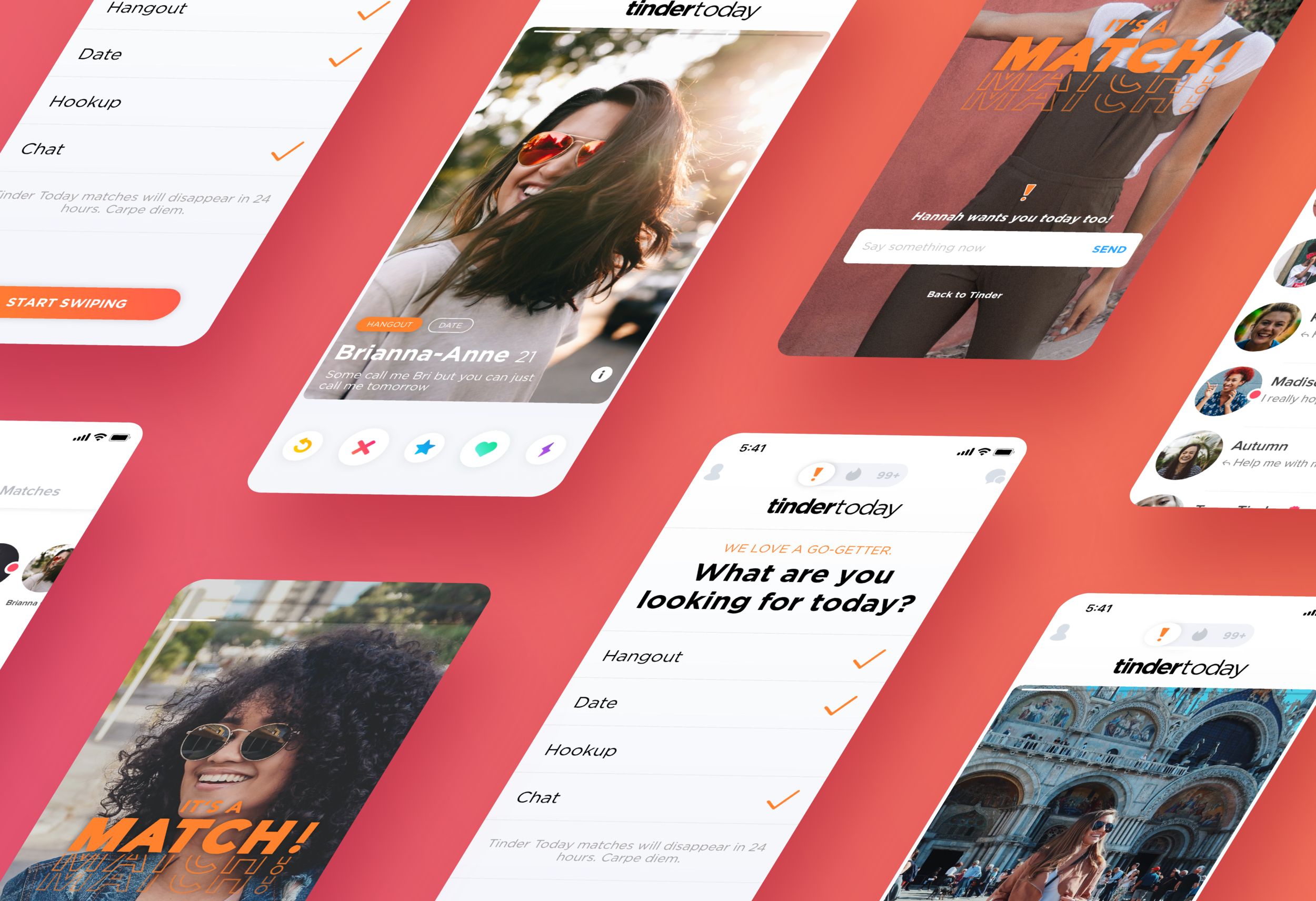
After weighing each idea, we decided to go with Option 2 because it most clearly and efficiently alleviates the user pain points and helps the user accomplish the goal of meeting people who want to do something today. These users would also only get 24 hours with their match until they are unmatched with them to encourage them to follow-through with their intentions immediately. We also came up with our feature name: Tinder Today.
03.2 Wireframes
For the user flow of the new feature, we wanted to make sure it integrated well and was within easy access of the current card deck screen. Tinder is known for its simplistic user interface, so we wanted to make sure the addition of this feature was simple in its visual design and didn’t add any additional complexities to the user experience.
03.3 Prototypes
Menu Navigation Bar
To access the Tinder Today deck, we added an extra option to the current menu. There were many different designs we considered while developing the bar (final below).
Deselect Mode
When the menu is on normal Tinder (the flame), how should the other two options look? We considered making the Tinder Gold option gray, making the Tinder Today option orange, and a combination thereof. We ended up selecting Option 1. Keeping the Tinder Gold tab gold was important for business metrics and increasing conversions to the premium subscription. The same is not applicable to Tinder Today so we kept the “off” state as the normal light gray.
Selected Button
How should the Tinder Today slider look when it’s on the page? We debated between white on orange (loud, brings a sense of urgency) and orange on white (classic, simple, coherent). We selected Option 2, orange on white. We valued consistency with current design over bringing attention to the new feature.
Tinder Gold
When the menu is on Tinder Today, should Tinder Gold still be gold? This was one of the harder decisions because we knew Tinder Gold sales were important. However, we decided that when the user toggles all the way to Tinder Today, the gold will fade into gray to not confuse users what tab is selected. The gold will return when the user is back on the flame. The changing and almost flashing nature of the gold when users toggle between Tinder Today and original Tinder will bring attention to the feature, arguably more so than before.
Profile Intention Tag
It is important for someone seeking a match today to not only know that potential matches want something today, but also what that match is looking for. We solved this problem by adding tag bubbles on the profile cards. Intentions that match your intentions will be in orange and those that do not will be in white.
Visually, we debated between outlined bubbles or filled bubbles. The outline bubbles were less distracting and put the user’s eye back on the important action buttons on the bottom; however, we ended up going with the filled in bubbles after considering the contrast between the words and background will increase readability and make for a more accessible design.
It’s a Match!
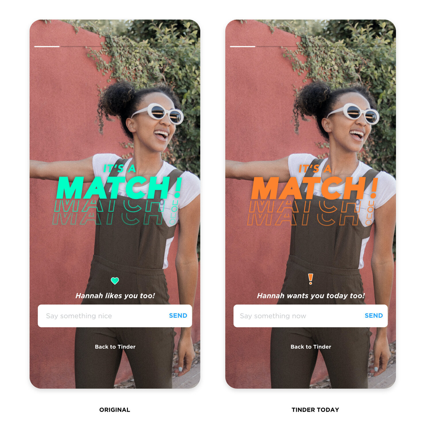
The “It’s a Match” screen is one of the most important and rewarding moments for Tinder users. We wanted to differentiate the screen from the current Tinder match screen to make sure the user knows that the match is only for Tinder Today. Key changes made are color changes (green to orange) and the messaging.
Chat Overview Screen
On this screen, we had to balance the already existing symbols with a way to mark Tinder Today matches. Option 1 would be the cleanest: use orange circles instead of pink circles to mark new Tinder Today messages and matches. However, there are two problems with this: 1) the orange and pink color are extremely similar, especially in small doses, so upon quick glance, all the circles appear the same color, and 2) after a message is read, the circle will disappear; how will you know which matches are from Tinder Today? After playing with positions of the Tinder Today exclamation mark symbol, we ultimately decided to go with Option 3. The placement of the exclamation mark on the right side of messages allows the user to find the symbol quicker due to being in a consistent place.
04 Solution
Swipe, match, meet today. Sometimes you just can’t wait.
Tinder Today is a new feature for when you are seeking a match, today.
Enter Tinder Today by navigating to the exclamation mark in the central navigation menu. Select what you’re looking for today, and start swiping. See other singles in your area looking for something today, too. But beware – matches only last 24 hours. Message them before time runs out!
05 Learnings
Consider business goals when making design choices.
This was important in our considerations involving Tinder Gold and when we were deciding how to approach implementing our new feature. In the end, we don’t only want users to be happy, but we also want the business itself to be meeting its internal metrics, whether it be Tinder Gold conversions or interactions with certain buttons.
Reflect upon why a feature hasn’t been already added.
Just because something can be done, doesn’t mean it should be done. This was important in our ideation vetting phase because it reminded us to take a step back and look at the idea in relative to the business as well. Just because something makes sense to be added to the product, doesn’t mean it will also make sense in terms of business strategy.
06 Next Steps
If we had more time, I would’ve loved to do some usability testing. While we did test the app flow within our group members (some of us used Tinder regularly), it would’ve been nice to have some outside opinions on feature and flow as well.


